CASE STUDY

PROJECT OVERVIEW
BRIEF
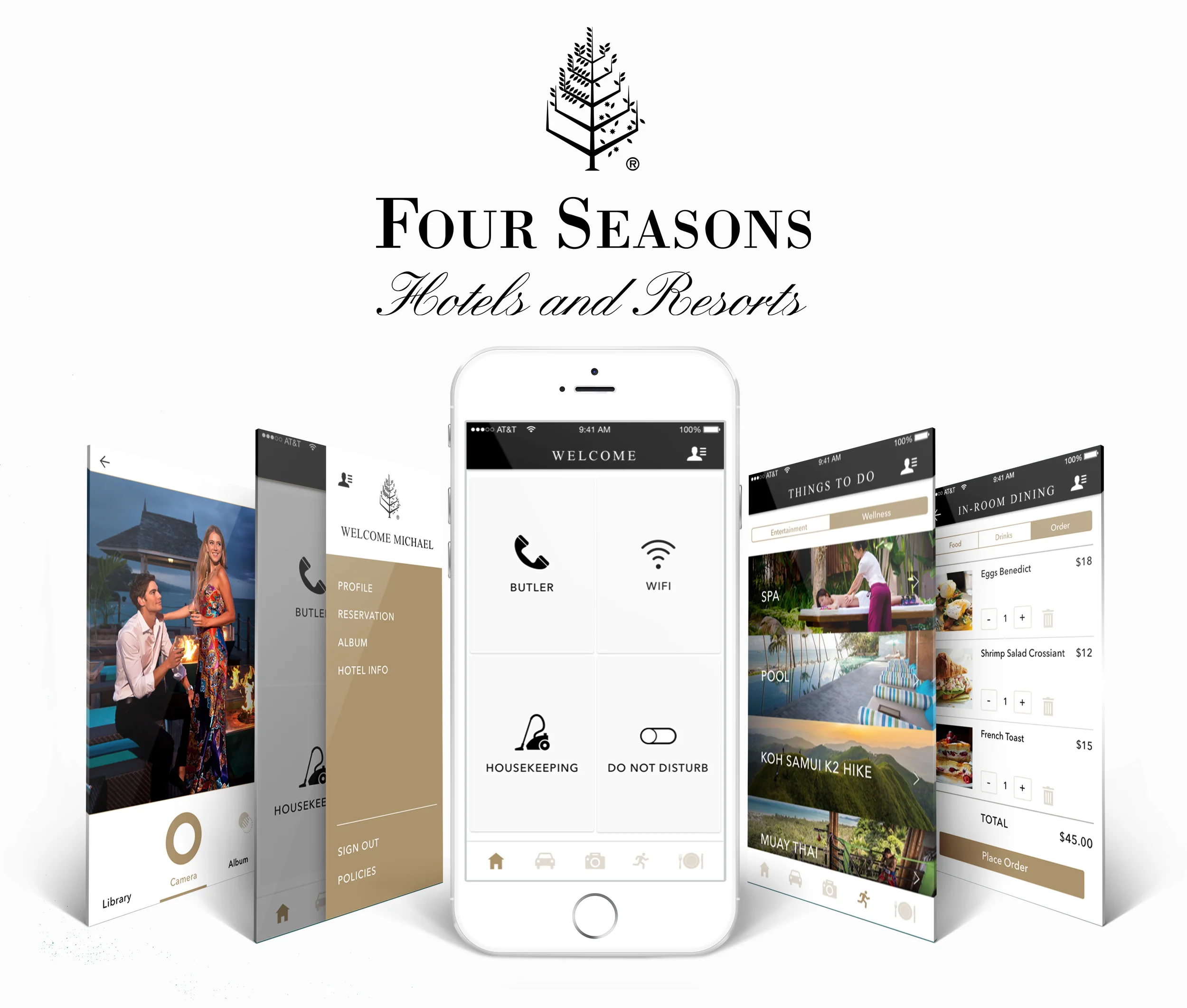
Four Seasons Hotel is an international 5-star hotel chain. Because of the fast growth of 3rd party platforms that capitalize on discounted rates for rooms, Four Seasons’ own website and app can no longer compete or differentiate their offerings. The company needs a redesign of the digital experience to attract more tech-savvy demographics.
TOOLS & METHODS
OmniGraffle, Sketch, InVision, Adobe Creative Suite, Brain-Pen-Paper, User Research, User-Centered Design
TIME & DURATION
2 Weeks, 4 People
DESIGN PROCESS

1 RESEARCH THE BRAND AND USER
UNDERSTAND THE BRAND
Problem with current digital experience| Since the design brief said the current digital experience, especially the mobile app, is fragmented, our team started the research by looking closely at the existing website and app. Also we read reviews for the Four Seasons app in the app store.

We realized that users are mostly looking for practical and convenient features, such as setting up time frames for housekeeping, making reservations for dining or activities and contacting concierge. We kept those insights in mind as we moved along.
Competitive Analysis| We compared Four Seasons with 3rd party platforms with the focus on technologies, features and content. The competitive analysis helped us to understand advantages and disadvantages of current Four Season digital representation.

Comparative Analysis| We ran comparison between Four Seasons and alike premium brands. Since Four Seasons is known for its superior customer service and great reputation, we wanted to explore how other brands with similar characteristics are highlighting these qualities to attract users.

UNDERSTAND THE USER
Empathy Map & User Interviews| To better serve the users’ need, our team worked on an empathy map, in which we made hypotheses on our user needs. Then we went to Four Seasons and similar hotels such as Intercontinental and Ritz Carlton to conduct field interviews. We were able to understand who our potential users are, their travel habits, interests and what they look for when they book hotels, which became extremely helpful later on when we built the personas.
Here are some valuable quotes from the interviews:
“Guests are not here to just stay. They are here for an experience.”
- Doorman at Intercontinental
“If it’s so expensive, I want the best experience I can possible have.”
- Family traveling for a sport event

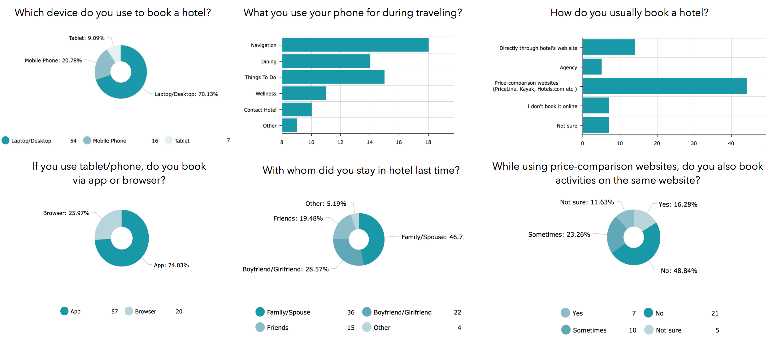
Survey| The survey was sent out online. The results helped us prove and disprove some of our hypothesis about our user needs.
For example, initially we wanted to create an app for booking hotels since our target audience are tech-savvy and are very familiarwith apps. However the survey showed us that 70% users book hotels on their desktop computer. Therefore, we have to adjust our solution based on these research results. These insights from the survey helped us make decisions along the way.
2 DEFINE PROBLEM AND PROPOSE SOLUTION
IDENTIFY THE PROBLEM

Insight| After the research on the brand and the users, we were finally able to construct the problem statement. A great insight we gained from this process can be expressed in this famous quote:
“ If I had an hour to solve a problem. I’d spend 55 minutes thinking about the problem and 5 minutes thinking about the solution.”
- Albert Einstein
Personas| With the information we gained from user interviews, the surveys and the affinity map, we were able to build up the personas that reflect the pain points and interests of our users.

PROPOSE THE SOLUTION


3 IDEATION
The 4 of us ideated on what features we want to include, the overall information architecture, the structure for the site an how users can navigate in the sites. Then the groups was divided into 2. Two of us worked on the website and the other 2 worked on the mobile app. From now on, the emphasis would be on the mobile app section.

4 PROTOTYPE
USABILITY TESTING
I created wireframes and I conducted 10 usability tests. It helped me to identify pain point of current stage and continue iterating my design.
The homepage went through big changes. Below is the evolution of the homepage.

